What would art be without colour?
Saying that colour is one of the constituent elements of art means that you put it on the side of the essential, whereas it normally resides in a zone of distraction. In order to perceive colour a series of actions is necessary, and that makes colour a structure open to all kinds of experiments.
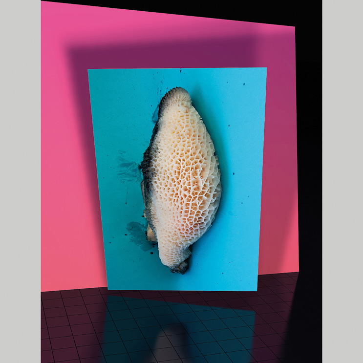
Roman Schramm. Tripe and Pink Wall, 2014. Courtesy of artist.
Isaac Newton in full-blown non-speculative times, managed to express a sustained theory in his investigations with prisms and light. Newton demonstrated that white light can be broken down into several colours and as such each one of the rainbow’s seven colours forms part of white light. At the beginning of the 19th century a writer of romantic backgrounds like Goethe displaced those findings towards a perceptive and subjective theory, subordinating colour to personal experience. For the writer our ability to see colour wasn’t just based on light but also on the psychological perception of that colour. The fact that such physical sensations were shared by the majority of individuals allowed him to develop a compendium of psychological meanings and effects that were taken up again during the 20th century.
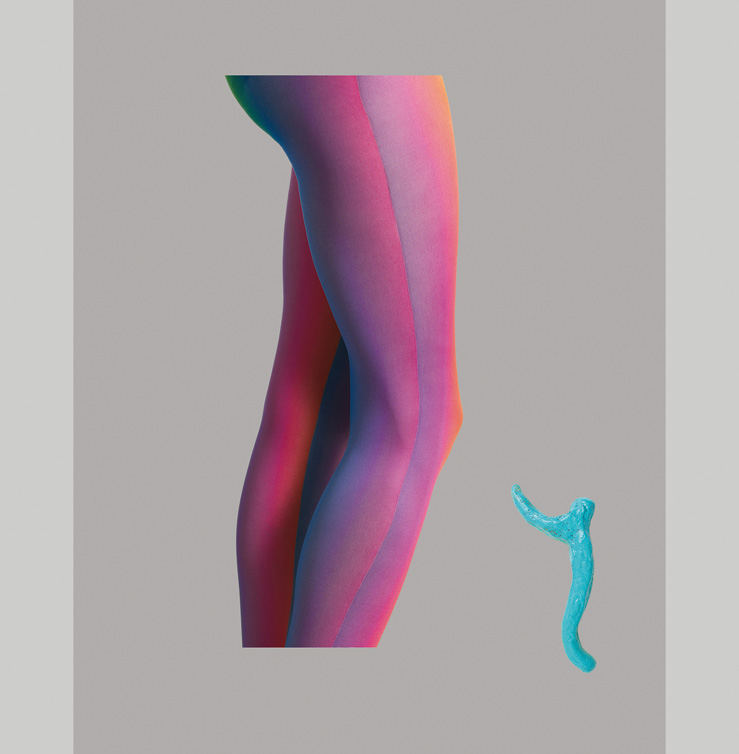
Roman Schramm. Ohne Titel (Italien), 2013. Courtesy of the artist.
Specifically, Paul Klee proposed the use of colours in relation to their weight, with the aim of configuring the balance on flats but also in space. “Colour possesses me. I don’t have to try to capture it”, he wrote. Josef Albers said that, in reality, an ugly colour does not exist, because any colour is capable of redeeming itself in the eyes of another. Colours compete with one another, they attract each other or they repel each other, and they are never independent. There are many studies on colour, however despite their differences they do allow us to conclude that colour is not a constant element. Neither is it a tangible thing because colour is a perception produced in the observer’s optical muscles. Colour is what clothes our experience of the world.
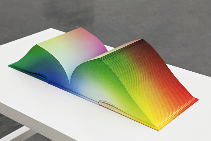
Tauba Auerbach. RGB Colorspace Atlas Volume 1, 2011. Courtesy of the artist. Photo: Vegard Kleven.
The pieces recently produced by Roman Schramm use colour assigned to determined bodies or parts of them to question, with mystery and a sense of humour, the representative function that photography holds in times of digitally constructed images. The inverted use of colour that Schramm creates to construct his images is what allows us to enter into a logic of appearances and, at the same time, it is behaviour that makes an image tactile, even if at first it wasn’t. The chromatic alteration of Roman Schramm, where hip bones are blue and a pair of legs are cloaked in iridescent leotards become an abstract plot: they are, at the same time, a way of establishing continuity between the image and a body. Artist and writer Tauba Auerbach focusses on colour and on the sensory theories that traverse it.
Miguel Mitlag. Tv set 2. 2010-13.
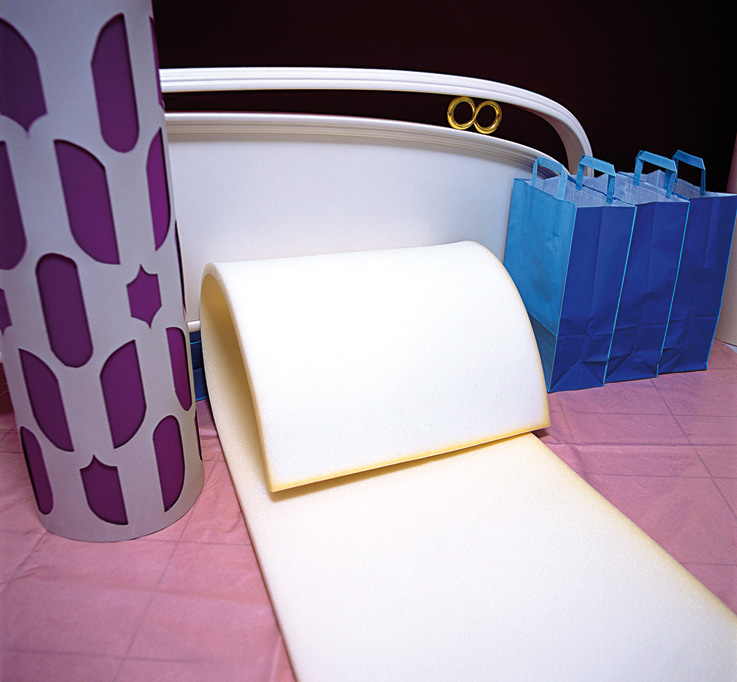
And she does it with the intention of discovering other canvases on which to paint. For instance in a cube-shaped book that is 3,632 pages long, understood as a three dimensional version of the Photoshop colours. Each one of the pages has one of the possible combinations capable of being assimilated by the eye, from the RGB colours (Red, Green, Blue). Colour awakens narrative connotations, we are all able to project some kind of reconstructed situation using colour. On occasions, that which at first sight is presented as a pure composition is, in reality, preceded by a long story. The effect of colour, just like perfume, fosters the indescribable. But the tale understood as an element of reference doesn’t always appear as an interest towards an event itself. The full-colour photographs by Miguel Mitlag suspend all specific evocation and they take us to recognisable interior spaces, whose action has yet to happen. Here, colour is an element capable of evoking atmospheres and objects: a psychedelic lamp, a carpet rolled up for a day of house painting or a series of paper bags hung up in order. Paying attention to these objects and scenes allows for the discovery of more than one possible tale.
Miguel Mitlag. Sensibility and feeling. 2014.
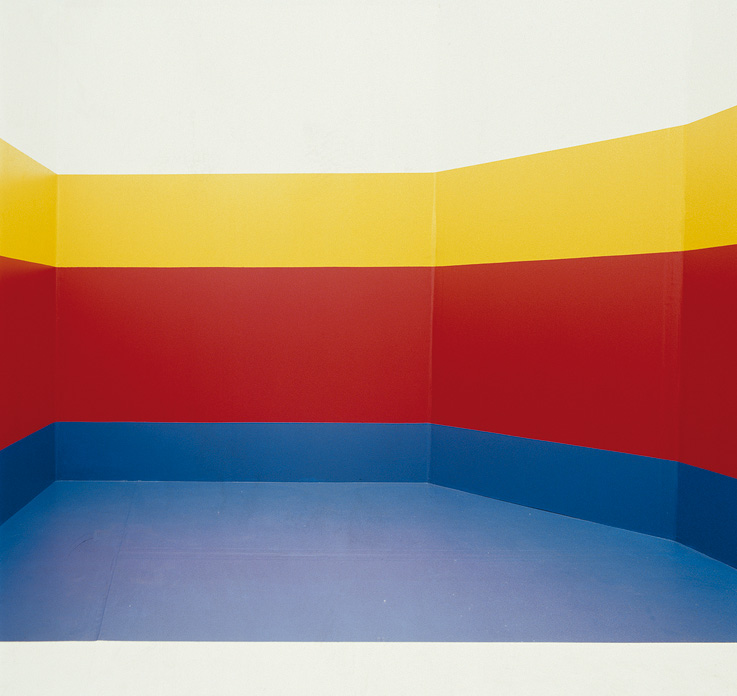
Miguel Mitlag presents them in the style of situations where the action can be developed and knows so little of what happens there as we do when we observe the pictures. Mitlag is interested in manipulating the neutrality that certain objects can assume, removing them from their natural environs or making their colours non-correspondent to their functions. Colour finds itself in a state of constant variation and it’s light that governs that change. The eye adapts itself quickly to the changes in light and makes colour a state as variable as it is constructive. Rays of light conduct colour and transmit information. Light carries colour and it equals or accentuates everything it traps within it. This is known full well by painters of domestic detail such as Chardin, who flee from the rules of representation. There are painters who, like Pieter Vermeersch, also put this into practice with the aim of expanding the structures of perception by making them into spatial interventions.
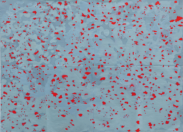
Kiko PĂ©rez, Untitled. Â
The light degradations that he makes on walls become, in turn, the canvas on which to put paintings or photographs of monochromatic appearance. But this abstract dimension, where colour is presented as a channel of light in full transformation, comes out of the observation and replication of an impression of the light that surrounds us. The question of how to communicate the inexact nature of a collection of feelings also appears in the work of Kiko PĂ©rez. Every one of his pieces, as pictorial as they are gestural, come from the recognition of a centre of attention within daily activities. This translation turns them into colour compositions that are barely recognisable, but once immersed in their dynamic relations between rectangles, lines, circles and superimpositions, determined compositional logics come back, as if the artist were printing them on a negative. A packed display of products in which the colour palette draws horizontal and vertical lines or the optical tricks of a material which produces curves on a surface which is, in principle, straight.
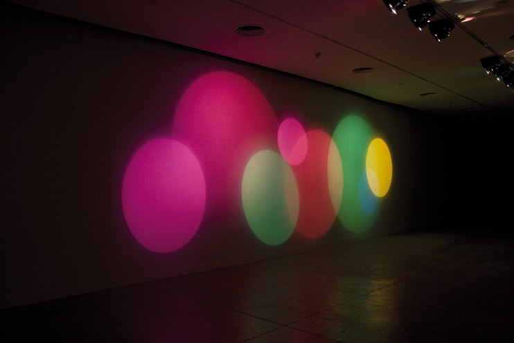
Karina Peisajovich. Colour making machine. Eight-movement suite 2010.
Kiko Pérez seems to be declaring the total use of the body and not just that which guides and coordinates the visual field. The artisan textures that the artist composes using varnish and juxtapositions, where the chromatic effect of the same piece of paper is modified when in use, coincides with one of Wittgenstein’s “Remarks on Colour”: -It’s easy to see that not all the concepts of colour are logically homogenous. There is a difference between the concepts of “the colour of gold” or “the colour of silver” and “yellow” or “grey”-. Investigating the perception and properties of light are also a way of renewing canvasses and techniques. In these kinds of conversions, colour becomes tangible. Karina Peisajovich puts forward a visual situation devoid of all narrative speculation. We could say that she paints with light, calling up another kind of tactile touch. Colour becomes a generative substance with temporary existence.
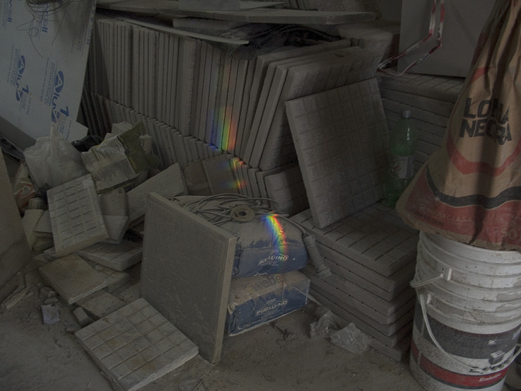
Karina Peisajovich, “Every time I see a rainbow”, 2011
Each one of the light machines that project pools of colour on areas of low light intensity in Karina Peisajovich’s work become sensorial environments susceptible to being experienced by the public. Activating illusionist resources and not hiding the mechanism that allows for the construction, each piece induces the retina’s muscle to experience a unique perceptive experience. And it’s this new meditative intensity which we face with our own mechanisms of visual construction. These mechanisms make light and colour into a surrounding material, rather like the visual but also tangible capsules of the writer Juan José Saer: “The two living stains, red and yellow, that move in the greenish grey space, look like a collage of glossy paper on a background of watery monochrome, of which the air would be the most diluted surface, and the clouds, the Earth and the trees, the most concentrated masses of grey”. The reconfiguration of sensory experience, developed by different artists, suggests we go beyond the optical fact and transforms external ocular vision into a place for introspection.
Text: Mariano Mayer


